Spawn by Greg Capullo
This is the first in a series of blog posts inspired by lee moyer's The Elements of Illustration and Ideas Made of Light blog. I'm going to be taking a lot of the illustration work I myself admire and try to break it down into why it works the way it does. After watching the following video from Anthony Jones I realized that I was missing out on a lot of potential things I could have learned from copies of master works I've done in the past. Too often I've found myself copying a master work, but at a loss to find out why my own work didn't seem to be at the same level or what I should be taking from them. This blog is a way for me to correct this.

Growing up Greg Capullo was my hero, When he began working on spawn he took what was originally a Spiderman and Batman hybrid and turned him into a something closer to Frankenstein or Freddy Krueger.

Ignore the foreground for a second and you can see a composition of a close up shot of a scowling forehead and eye. Symbolizing someone (maybe Satan himself) is watching down on Spawn. If you look at the general shape of the negative space around Spawn and how the cape cuts diagonally downward with the landscape below rising almost enough to meet it on the right to make an elongated oval shape. The shape of the cape as it goes up and to the left could be seen as the scowling eyelid and forehead. Greg Capullo is known to do this sort of thing to his illustrations on batman:

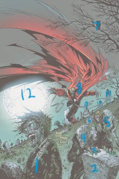
There is a lot of overlap going on here in the illustration and I've numbered them in order as they work their way back into the illustration. Also note that on Number 6 there are two other tombstones at the same level. This could be just to box the eye in and keep the distances uniform across the picture.
Focus
Our focus bounces back and forth between the first zombie and Spawn but carries in a circular route from the first zombie, to the second, then the third, then to Spawn, to the moon, and back to the zombie in the front.
Narrative
I haven't read Spawn in years so I don't remember any of the stories, but I doubt this was about any particular story. It was much more about the concept. Most of Capullo's covers are more conceptual rather than literal. This cover feels reminiscent of earlier issues of Spawn where he goes to his own grave to dig up his body.
Composition
We have a lot of different elements used to create a depth of field around Spawn hes blocked in from the negative space created by the moon, his cape, both trees and the landscape beneath him. The line work in the cape could double as arrows all pointing to Spawn. The zombies are like stepping stones to Spawn that create a circular composition.
Palette
The colors of the grass, the green fungus on the zombies and the blue tint of the sky are all the same tonal range. Very dull colors that contrast to the bright red of his cape. He also uses yellow in the third zombies hair to help make the transition.
Value
Our foreground is defined by our darkest values, which contrasts to the light of the moon and the variation picks up the most at our focus point: Spawn.
Mass
Capullo uses a variation of light to light and dark to light transitions on the cape which gives an abstract look to it but is still recognizable as a fabric.
Texture
The linework here is used to create the texture on the faces of the undead. They contrast with the cleaner shapes of their suites and Spawn's cape.
Symbolism
This was mentioned before, I feel like this is intentionally reminiscent of the original books. Spawn is back from the dead, but something is watching his every move.
Micro/Macro
The linework in the hair and facial details of the zombies is also implied on Spawn's face.
Ornament
Grass and moss/fungus on zombies. The crater lines emphasized on the moon.
Juxtaposition
The contrast points between the zombie head and the moon itself. The contrast between, the bright red cape and the muted blues and greens of the zombies and graveyard.
Greg Capullo
Growing up Greg Capullo was my hero, When he began working on spawn he took what was originally a Spiderman and Batman hybrid and turned him into a something closer to Frankenstein or Freddy Krueger.
The Big Picture
The first thing to look at is how the composition has an entirely different second read in its composition. If you take the image and make it black and white and play with the curves a little you get this:
Thumbnail analysis and
Perspective/depth
Here we have a simplified version of some of the value tones and how they contrast with what is around them on the page. There is almost a rhythm to the number of different tones of value and where they are placed. In order for a illustration to be successful it needs to have the full range of tones that define the foreground, mid ground, and background. Capullo uses multiple forms of overlapping and a rhythm of tones that climb from the bottom left of the page to the middle of the page where Spawn is.
You have the first zombie, that's midtone head is contrasted against the bright light of the moon. Next to him the second zombie is contrasted, both by the midtone tombstone in front of him but also the zombie who is a higher key of white behind him, also notice her hair is yellow. So we are now moving away from the greens in the foreground to the red found on Spawn's cape. It also gives you an idea of where he is placed. We then go back to a midtone with the grave stones that seem to be level with the tree right in front of spawn that cuts into the picture.
We then see spawn, placed in between two points of interest that tell us where he is in the picture. One sits in front of him, the other a fair ways back. We know he is at the top of the hill, but there is still a distance behind him that wraps around to the declining side of the hill. So we climb up the picture with the different "beats" of tones til we get to Spawn, then we climb only a little more before Capullo shows us more depth of the graveyard beyond the hill.
There is a lot of overlap going on here in the illustration and I've numbered them in order as they work their way back into the illustration. Also note that on Number 6 there are two other tombstones at the same level. This could be just to box the eye in and keep the distances uniform across the picture.
Focus
Our focus bounces back and forth between the first zombie and Spawn but carries in a circular route from the first zombie, to the second, then the third, then to Spawn, to the moon, and back to the zombie in the front.
Narrative
I haven't read Spawn in years so I don't remember any of the stories, but I doubt this was about any particular story. It was much more about the concept. Most of Capullo's covers are more conceptual rather than literal. This cover feels reminiscent of earlier issues of Spawn where he goes to his own grave to dig up his body.
Composition
We have a lot of different elements used to create a depth of field around Spawn hes blocked in from the negative space created by the moon, his cape, both trees and the landscape beneath him. The line work in the cape could double as arrows all pointing to Spawn. The zombies are like stepping stones to Spawn that create a circular composition.
Palette
The colors of the grass, the green fungus on the zombies and the blue tint of the sky are all the same tonal range. Very dull colors that contrast to the bright red of his cape. He also uses yellow in the third zombies hair to help make the transition.
Value
Our foreground is defined by our darkest values, which contrasts to the light of the moon and the variation picks up the most at our focus point: Spawn.
Mass
Capullo uses a variation of light to light and dark to light transitions on the cape which gives an abstract look to it but is still recognizable as a fabric.
Texture
The linework here is used to create the texture on the faces of the undead. They contrast with the cleaner shapes of their suites and Spawn's cape.
Symbolism
This was mentioned before, I feel like this is intentionally reminiscent of the original books. Spawn is back from the dead, but something is watching his every move.
Micro/Macro
The linework in the hair and facial details of the zombies is also implied on Spawn's face.
Ornament
Grass and moss/fungus on zombies. The crater lines emphasized on the moon.
Juxtaposition
The contrast points between the zombie head and the moon itself. The contrast between, the bright red cape and the muted blues and greens of the zombies and graveyard.


Comments
Post a Comment