Jakub Rebelka Study
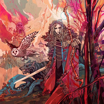
Continuing to try to improve my understanding of color and value, I decided I would do this next study slightly different than the previous ones. What I did was actually mark every color with what I thought its value was and then turned the image black and white in order to then sample and compare to my value scale on the right. Some of it may be pixelated but you can see some of the results below.
Alright not bad but I wasnt completely correct either. Some of the assumptions I made from the get go ended up being wrong. For one I thought the red value of her dress would be darker than the ground behind her to the left. What I found was that I was close to being correct on the values of the red and blue dress and completely off on the background. The background is actually a 3 and not a 5. I know my scale is small here on the image but here is the color and value scale posted below:
The reason I was wrong is perhaps I was thinking about it too intellectually or conceptually rather than looking at it. Now that I see the difference in her silhouette value versus the background its completely obvious but conceptually I know that red is a darker color so therefore it should be a darker value than the bluish background. However this is not the case. What is interesting to note is the value of the blue in her dress and the value of the red in her dress are very close in value although not the same color. This reminds me of a value technique that Adam duff from Lucid Pixul taught me where you take a series of colors and try to match their values over the spectrum of color. What we see in the above chart is where each color falls on the range of value. We can see a color like yellow does not have the same width of value as a blue does. Infact you could almost say that yellow orange and red are a continuation of the value scale, but the color changes dramatically the darker the value is versus the blue which is still recognizable as a blue throughout the whole range of value. Below is an example of the exercise which I will be doing daily:
Here I started with a mid tone red and moved the color towards the right and put down a new swatch of color down, I then turned my next layer into a gray scale and tried to match the value to the color. What I noticed was that I was not too far off in the right side of the specturm but the left side was not correct especially when I got to the yellows. This makes sense because yellow does not have the same range in value as the other colors, where as on the right I could get away with keeping my color picker in relatively the same spot and get a close result. Trying to do this with the yellow on the other hand makes the B value on HSB scale jump from a 38 to 40 % to 50. It takes it from a darker midtone to a 50/50 midtone. These dont match up completely, but I wanted to change it up and try to challenge myself again. So what I did was try to instead pick random colors and find the values for each. Another interesting thing to notice here, is that although the values in the above colors do move around, since they are still close to one another they do harmonize and feel like they fit together. Below, however this isnt the case:
The colors here, together look like a disoriented mess! These are the sort of colors a child would pick at random when he/she thinks of a sky they pick the brightest blue to be as literal as possible. What we disccover when we look at other artists though is that their color and value choices are very deliberate and rarely go to these levels of saturation. This is a good exercise though and what would be another one would be to see if you can create a dark, light, dark rhythm of values lined up to one another like this. How would you pick those colors and what kind of effect of rhythm would those values have? Whats interesting is that you could theoretically change the colors but keep the value in that rhythm to create some interesting colors. Analyzing the above piece I notice I am way off on my B value. Notice that on a B value on a HSB scale the higher number actually means less black in the color. So for instance in the third one, I thought there was less black than there really was. My biggest faults being in the last 2 where the green, although it is saturated it is a midtone value, and where as the blue is very saturated as well it is not a midtone, and instead has less black in it then I would have assumed after getting the value on the green wrong.
Now going back and looking at the values again after doing this exercise, I asked myself how does he group the values and how does this relate to the colors he picks.
For instance when we look at the image he obviously groups the values together, with the widest range of values on our foreground elements of the woman. In the back to her left we see a good amount of midtones though and we can notice that the foreground elements may have midtones as well especially in the highlight breakdowns but they are darker grays for thee most part and he holds the lighter midtones in by encasing them in a overall darker midtown that covers the full foreground elements, including her, the trees, the rocks the ground and her dog. He also differentiates the owl from the background with the darker part of the shadowed wing.
Colors: Its not all as they seem
We see here in the background that the colors he picks are found throughout the rest of the piece in the pink and orange colors that he has on the right side of the tree and in her dress the color spectrum here ranges from oranges to pink purple and red. These colors feel vibrant next to their complimentary colors of blue. What is also interesting about the colors is that he is very aware of how the appearance of a color will change depending upon what it is next to. So for example, the colors behind and above the pink and purple on the left looks to be a pale green at first glance. But in actuality it is a desaturated grey orange. This is the color he chooses to use for the sky and the shadow of the cloud in the sky.
As the cloud gets closer to our light source above her head and in the clouds we see he adds more and more saturation of orange but still keeps the value low, and then blocks in the shapes of the cloud facing the lightsource he desaturates and pushes the value all the way up but still leaves some orange there and it contrasts naturally with the blue of the orb above her. Speaking of blue what I really enjoy about this piece is that he isnt afraid to go off the beaten path of what to color what. The tree being blue and the sky having vivid pink colors with tones of orange spread throughout as the lighter midtones creates really interesting piece. Orange acts as a bridge between the vibrant red and the blue and he builds this bridge to blue by incorporating gray oranges.
Composition and silhouette
Now we get to look at the compositional elements and how they are arranged. We see in our foreground bunches of trees that spring up and cross over one another, the branch in front following the same kind of curve the bottom of her dress does and this curved line connects with the branch she is holding and the tree shapes on the right that keep our eye from wandering off out of frame. Much like we have see in other illustrations we see that these foreground elements are often darker. Notice that these darker shapes do not stay dark in the staff she is holding they actually drop in value.
The staff weaves its way up her silhouette and we notice that her right side is also a straight line. This is interesting and we will come back to that momentarily. The staff comes all the way up and connects to the lightest point all the while taking us through the focal point which is our character holding a sword, obviously. Our eye naturally falls from the face/staff area down to the left where we see the second and third focal point. Notice that the woman, wolf and sword all create a very dynamic and interesting silhouette. We also notice that the background shapes are all grouped together and do not leave and enter into the value range of the figure in the front.
The silhouette has what one would call a strong sense of design and this design is accomplished by the contrast between the two sides of her. One side of her is straight, almost like a sides of a triangle. The curves of her robe point us up towards her face meeting in the middle of her body like two straight lines that point directly to her face, our focal point #1. The silhouette contrasts with the ruffled wind tossed shapes of her left side with the straights arranged on her head cape, we then see tthe ruffled feathers of her clothes that then go down and contrast again against the straight strong lines of the sword which contrast to the more abstract and flowing lines of the bottom of her robe.
If you connect the sword and wolf silhouette it gives the whole silhouette a very menacing appeal. Some other things I noticed was the repetition of horizontal lines, we see them in the wings of the owl, the horizontals on her costume , the details of the trees and staff and the pattern we see on the wolfs fur. He makes sure to add plenty of patterns that make the piece look interesting.
Above in the top left is a breakdown of the silhouette he created blocked out. The rest are me taking this idea of contrasting shapes and playing around with them to see what kind of effect I can get. Comparing mine to his the next one over IT feels too symmetrical to be dynamic, and the bottom half draws way too much attention to itself while serving no real purpose for the design. I took note of this and tried turning the silhouette sideways and applying these changes to the silhouette and what I came up with at the top right is infinitely better than the other 3. Here we have a sense of gesture, you can almost feel that he/she is glasping the sword with two hands, the sway on the bottom creates an interesting shape that directs our eye upward and the sword breaks up the organic flow of the rest of the shape up very nicely. The bottom two are attempts at exaggerating the top feathering and both are uninteresting.


Comments
Post a Comment