Zeen Chin Color and Value study-read over by tues
Value and color
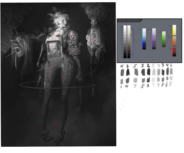
Just like last time what were doing today is beginning with a breakdown of the value structure of the piece, labeling each and then we will be discussing color.
Going through I numbered each value to what I best guessed as being its value and then I took samples of the palette he used and tried to break down the values for each color. So I'm in essence reverse engineering the color layout he used and connecting it with my knowledge of value. I find the analysis of his value and color work to be very hard to grasp at first because there is a lot of variation in value in his shadows and he seems to rely heavily on ambient occlusion to give his piece that 3d effect.
What I noticed immediately about the values is that he has local colors for each individual element of the clothing but that does not mean that the value is different although they may appear different. For example the red and the blue in the pants as they rise up her legs to her hips have the same local value although it appears different since the blue naturally looks lighter. We see as we follow the form up that the stomach we see provides a strong break from the values below it and our values continue up a key from a 7 to an 8 on her shirt and then the lightest spots we find on her face, our main focal point.
When i originally had the image black and white i was at first confused that the value of her legs and the value of the background is so close. How could it be so close and yet look as if it is popping forward from the background? For one it is the strong shape, the background is a mist that has no edges, whereas her leg shapes are strongly defined, but what is also interesting is that the contrast of the blue background to the red of her pant legs helps push it forward while still being close to the same value. Simultaneous contrast is found here that a dull contrasting color will make a brighter color appear brighter than it actually is.
I noticed this many times throughout the piece, the values are in some areas kept very consistent with one another even though every section of her is colored differently. The values on her red and purple jacket arm is more consistent with one another versus the blue which is at a slightly higher key making the blue parks local value a 6 and 8 for the whiter parts, where as the lower parts are closer to a 5. Each piece though respectively has its own local value, and shadow value. For instance the shirt she wears is at a high key where as the shadow dips down into a 6 and a 4. This contrasts against the clothes underneath her shirt that we see is a 4 with a shadow value of a 2.

Some of the other things I noticed about color is that his shadow colors rarely wander past the color of the local object. The jackets deep shadows fall into the dark blue, losing themselves in the background. Where as the shadow on her face dips into a desaturated yellow for its shadow. The face colors are actually quite interesting since they go from a very high key blue to a redder tone under the eyes as the face plane turns away from the light source. and then falls into a dark gray yellow for the shadow.
He gets a surprising amount of color range by keeping a lot of the colors in similar value ranges. For example he has all of the dull yellow in her belt, the artifact/doll on her hip, the yellow in the paper of the...uhh heads face on the right are all the same value or close to it. Its also important to point out that the values of the doll and the values of the face shadow are very similar as well, just a little different in their colors.
Value keys
Whenever I look at and analyze the value keys I made for the piece based on the color palette I realize that I have the habit of thinking something is lighter than it actually is, out of all of them I only got 1 right and acouple of them I got close.

Form
Above is a form breakdown of the image as if it was a wire frame of the illustration with some practice form drawings from reference and memory on the side. Immediately Ive notices some things by doing this that I wouldn't have noticed otherwise. For one that right side of her arm is by far the most complex form in the piece. When you break down the wrinkles in the sleeve you can follow each one up as they curve and rotate upwards eventually the curves turn us towards the face. This is a nice addition to the focal point of her face. He obviously wants us to look at both her face and the two faces we see on the side of her arm. I noticed that the form makes up lots of different sizes of shapes: Some big, some medium, some small. They arrange on top of one another almost like triangles counterbalancing one another with the fat end hanging out as they go up the arm until the get to the top face.
He breaks up the form by adding some straightened curves of the sign the head has beneath it. before going back into the curves for the rest of the jacket. Breaking down a form like this into multiple smaller turning forms is thee take away I got from this. I also noticed that the perspective on the legs changes when you compare them to one another. The perspective shift is subtle but on her left leg we see that at the kneecap area our form lines begin to change and go backward in space. We also see this in the feet where we are looking slightly above in perspective at the left foor and slightly below the perspective on the other. The form on her shirt that we see contrasts to the curves of the jacket to be more like straight lines that cut across the form. This adds contrast and brings some pattern into the piece. Similarly we see that same pattern in the two lines going up underneath her shirt.
You can find more of Zeen Chins work here


Comments
Post a Comment