Mike Mignola Analysis 3
Composition
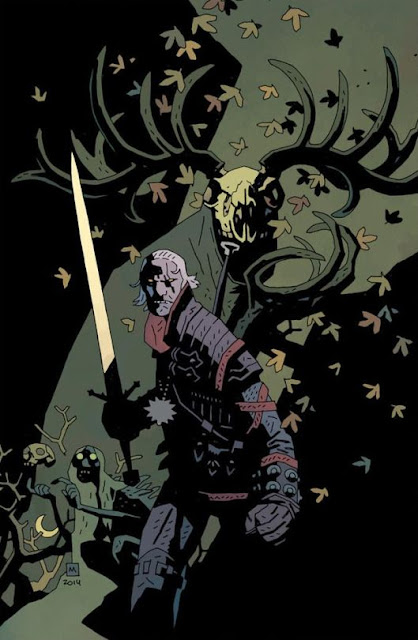
Mike Mignola has a tendency to make his images in a montage style for covers. These covers usually suggest the characters and places the story will visit and usually drops in some sort of hint as to key story points. Here we see a strong diagonal composition that cuts through the image from right to left. In the background we can assume the shadow shapes are some sort of buildings that create the chance for the sky to have this kind of rectangular shape. Its interesting to note that the value shape of the background intersects with the shadow shape of the background figures cape that acts as a backdrop for the character on the bottom left and also gives a background for the silhouetted side of Geralt.
Geralt basically ha two sides to him in this illustration that contrast against one another that makes him the focal point. On the right side off him we see a lot of detail and one could argue that mike mignola "exposes for the light" meaning that he puts all the detail in the light parts of the figure and doesnt bring out this detail in the shadow shapes. He does however show some shapes and suggests turning forms in the shadows of geralt but they are too a much lesser extent. Where as his face hand on the sword and even his pendant are more silhouetted shapes that make you know what they are from a distance. Notice that the silhouette side is on the lighter background and the detailed arm and shoulder of geralt is on the darker background.
This along with the contrast of shape and value between him and his sword obviously makes him the focal point. Mike uses the falling leaves to add neutral colors but also to break up the big shapes to make the overall page look more interesting. Here again we can also see how sometimes he drops these leaves into black on a gray background and does the reverse in darker backgrounds. Outside of that again we can see how all of the ddark shapes on the right side that connect to the three figures are all grouped together and connected by the darks in the values.
Its also interesting to note again how he creates a stair step level of importance between the figures as we see the figure in the top in the back and we go down and further to the left, but these figures and landmarks do line up with one another. For example you can draw a line all the way through each of their heads and geralts hand. This was definitely intentional as well as other things like the creatures hand is level with geralts face and the butt of his sword lines up to almost be like the bottom row of the teeth of the monster.


Comments
Post a Comment