Mike Mignola cover analysis
Composition
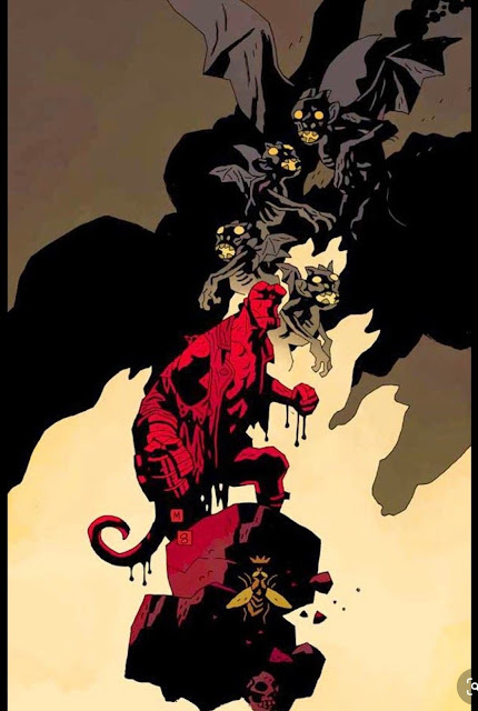
Another great cover by Mignola, this time he breaks up some of the usual value grouping strategies for something a bit different. We have a very center based composition at play that tends to the right of the image and leaves plenty of space at the top for the title while at the same time not being afraid to put some detail in the top.
We have hellboy in front and center with the most saturated color used explicitly on him and we see the red fades in saturation as it moves away from this focal point. The bee beneath him sits in a midtone that keeps it from drawing too much attention. In terms of his silhouette we see this is again another image that shows us a strong contrast between red and black, and in fact he actually has something dripping off him which one could only imagine as blood which explains why he is so red in the image and also adds some visual variety to his silhouette. Hi pose is nice and strong as if he is getting ready for a fight.
Behind him is the lighest value in the image which holds the silhouette of hellboy to push him forward more. This image would not have worked as well if it wasnt for this light value, if he had just dropped everything into black it would have been very boring and uninteresting, and of course he wouldnt have been able to create the cool silhouette shapes throughout the design with the shadow shapes.
The color and line work gradually fade into a brownish color and transition into the demons in the background which as we move up in the image we see that their shadow shapes are connected to the bigger black shape in the background, which tells us they are further back. I like again how when mignola overlaps figures he does so in a zig zag pattern. The first little demon we see is facing the same way as hellboy, which if it wasnt it would be very confusing and would create a visual tangent as if the two were looking at one another.
Then the next one is pointed in the opposite direction and then the one above that demon is pointing back in the same general direction as hellboy but hes also looking up at the figure above him which is the larger gargoyle in the back that is looking straight at us. The wings of the gargoyle both connect to the larger black shape and also break out of the silhouette of the shadow shapes creating a really interesting break. I also like how the wing shape on the back gargoyle demon dude has a crescent shape to it that pops out of his head and moves in the same direction backwards as the other wing.


Comments
Post a Comment