Coda book cover analysis
Composition
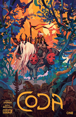
My god this cover is gorgeous! When I'm looking at this Im blown away by the variety of colors and values present here but the image is still coherent and fits together. If you turn this image greyscale a few things jummp out at you at once. For one the background values are very light where as the foreground colors are very dark. In the middle where our focal point sits we see this has the highest range of values with most of the contrasting darkest and whitest shapes are present in the horse and man on the horse. The surrounding foliage keeps out attention here without intersecting with it and allowing the light values in the backdrop hold the darker silhouette of the figure, his staff and horse.
In order to create this sense of distance and communicate this through values he uses light and shadow values that are close to one another and just shifts the color. This gives it the feeling of being high key in the background. Then in our midground we have an almost opposite effect going on Where there is strong contrast in the values and colors of the figure. Obviously this figure was designed to be our main area of interest and this is communicated in a variety of ways.
For example the X across his chest almost seems so simple but it contrasts with every other shape in the environment and really stands out as if saying X marks the spot. The bright red of the armor, and his outfit along with the design of his suit and the blueish horse contrast against one another. Red is used strongly in the midground image of this individual. As we move away from the center of the image we encounter a lot of blue and green in the foliage which is just so visually beautiful when contrasted against the orange and red background.
Value speaking the foliage exists in another value range that is specific for its placement. In fact there is a gradual increase of values from bottom to top of this area but again the values of the colors are close to one another, its just the color is shifted so that helps it feel organized and then in the front we have another set of darker values that are obscured by the logos placed at the bottom.


Comments
Post a Comment