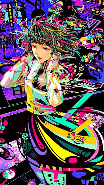
Color composition analysis
Composition, Color, and value
It wasnt until I started doing the various color studies over the last few months that I've been able to get to a level of understanding to be able to see what is going on in a piece like this. Here we see what an artist who understands value and color well experimenting with the way he/she communicates color. As I make my way through the workout session from Wouter on Schoolism I hear him say it over and over: you can play with color and get away more with color shifts than you can from value. The values in a piece have to hold together but if the value structure is legit, then you can go all out on color and shift the color around like crazy. Here below I've taken the image and made it black and white to show what I'm talking about.
Here we can see that the values are all grouped into their respective groups. lots of shapes of values make it feel almost like a posterized image at how well differentiated each value on each fold of fabric is done. For example we have strong diagonal lines that cut upward from left to right in the form of black lines that directly intersect with the flow of the dress that makes an oval like shape around her as if it is being pushed in the wind. These groups make a very interesting dark shape that grounds it to the bottom of the image. It makes the bottom of the image feel very heavy. Countering this we get looping swaying pushes of color that take is back in the opposite direction from the right to the left and point us upward towards the girl, one could image these are like the sun hitting the folds of her skirt.
They point upwards to where we see our focal point high is the blocked off forms of her upper body and face, these stick out as being in lighter value than the background and also because they form a distinct shape that does not blend into the background. Its a solid shape with high value key planes that differentiates it from the abstract background and the darker values in the backdrop.
Then once we look at it in color again we can appreciate how the artist is able to drop in lots of color variety while keeping the values the same and thus is able to put yellow and green, pink and purple next to one another along with lots of cool abstract shapes and color designs while still making it feel like it fits together. We can also notice that the bottom heavier side of the image contrasts to the top part in the size of the shapes that are used in each section. in the bottom the shapes of color are broad abstract and swooping pointing us in a general up direction while on the top part of the image we see the shapes are small and various color and shapes but generally fall into oval shapes if their colorful or spirals where as the black shapes in the background are much more square and straight. This is a good use of contrast of shape as well as variety and unity.


Comments
Post a Comment