foo fighters cover analysis
Composition
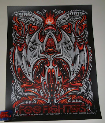
Really cool abstract album cover here. What I like and noticed right away is that both sides are identical. OI think what the artist did, or what I would have done if I was the artist would be to sketch this whole thing in pencil and then trace over digitally which side I thought looked best and then copy and flip it to put it on the other side. This to me is clearly the only way you would get this kind of consistency on both sides unless you were using a lot of curve tools and that sort of thing.
This piece seems to be drawing heavily on inspiration from alien, which i guess is obvious since we see the alien figures at the top and they are nested around a fire. Below them it looks like some sort of space craft with an orb or what could be an eye in the middle that sits right below a brain. I like this kind of drawing and how symmetrical everything in the piece is. There is constant repeating patterns of teeth like shapes, razors, and red swirls that suggest blood while the grey suggests something mechanical.
We see the suggestion of something mechanical in the way the highlights of white and the shading of black have squared end points where as on the blood red we see the end points are pointy or round and so are the mini highlights. The shapes of the grey are also much more pointier and take the form of wings and we can see a similar pattern of long to small repeat throughout the piece in the negative spaces created by the gray ship like shape. All of this creates a cool border around the type on the bottom which is red and fits in perfectly with the piece.


Comments
Post a Comment