Tomer Hanuka analysis
Composition
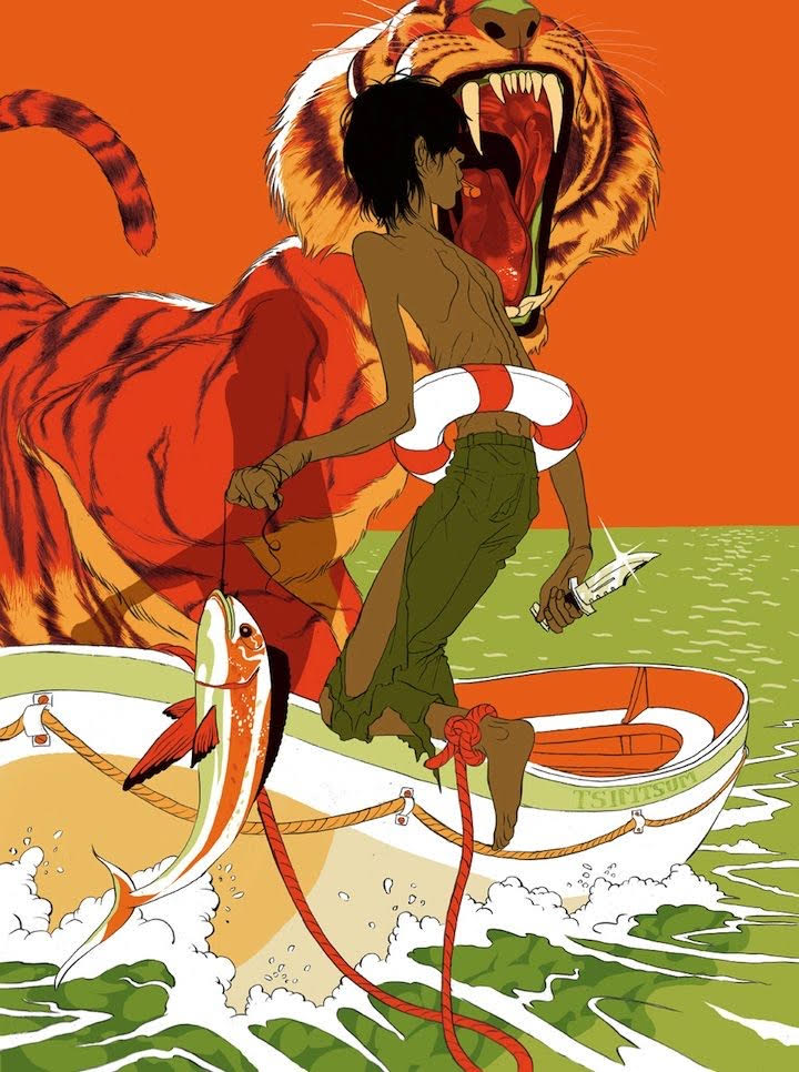
One of the first things that struck me about this piece was how closely related his values are. If you turn the image black and white you will see that the background value and the value of the figure, the figures shadow and the tiger are all in the midrange area. This is very similar to a recent schoolism workout I've been doing called Wouters digital painting. What wouter teaches in the particular lesson I'm thinking of is a strong sense of value control. Tomer if anything has value control on lockdown with this piece.
Each section could be blocked in in its entirety to hold one value per part of the boat, figure, shadow..etc. For example there is the lightest value of white that comes in from the edges of the page, that connect to the ship. Each one of these waves acts as a line directing us to the bot. We then follow the fish curving upwards pointing us to the two central figures. When it comes to the figure in the front we see he stands out clearly from the sky and the tiger by droping his value down but keeping a good amount of saturation at play. The tiger and sky are damn near identiccal in value but the color is shifted slightily to be more red on the tiger. This use of orange next to red creates a feeling of the tiger being very orange when infact he isnt. The white bunches of hair around him though are definitely orange in tone.
I believe the design decision here waas to bring the colors you think of when you think of a tiger into the other parts of the piece to hold it together. and the green used on the figure is reflected in the shadows, the boat and the water. The color is super stylized which i think is great.


Comments
Post a Comment