Character design analysis#5: Robot Pencil
70/30 rule
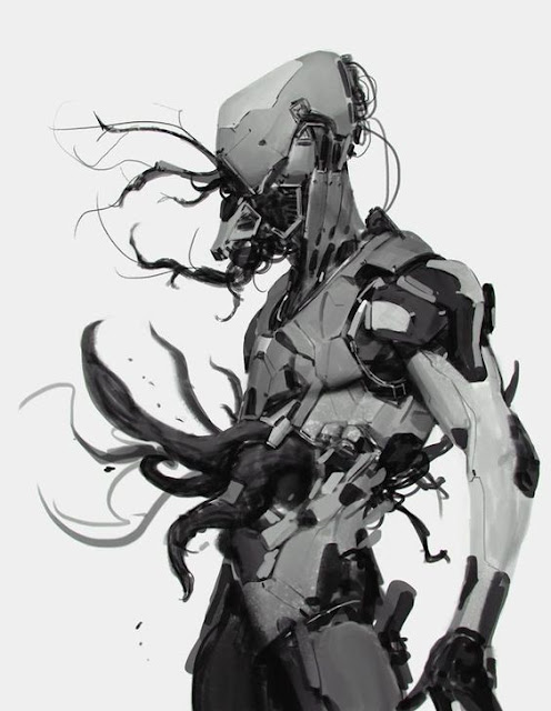
So one things AJ talks about is the 70/30 rule which is the idea that the design of smaller vs larger/medium elements should be balanced to roughly a 70/30 ratio throughout the piece. In the head we see this in practice as we see the vast majority of the head is one large shape of grey that is then broken down into a medium shape of white. Once AJ lays down a large shape like this he counterbalances it with a set of smaller shapes, so as he puts down the big shape he then immediately counters it by putting in the smaller or medium shapes surrounding the head. We can see that he concentrates this to his jaw and the back of the head with shapes that are much darker and smaller and they are organized together into one "package" of sorts.
Right next to these small shapes we see a "package" of medium shapes that connect the head to the torso. These are organized into a set of 3, which might fall under his "rule of 3" and now that I'm looking at it this is pretty much the only example of this out side of the 3 or 4 spots where the tentacles are bursting out.
As we go down the piece we see the medium shapes give way to smaller darker shapes again as we see them form around the bottom of the neck and the back of the head. This area connects us to the chest area which again is a big grey shape. This big grey shape then is counterbalanced by the big black shape on his shoulder, and the tentacle mass that is bursting out of his stomach and back. Again after this we return to the grey shapes in the bottom torso before getting another serious of small black shapes and darker grey legs that fall into shadow.
The design of the arm is similarly badass in that it is mostly a light grey white which is close to the value of the top piece of his head and then we see this counterbalanced with a darker smaller shape in the cuff of his arm, the elbow, surrounding the wrist and the hand.
What Aj likes to do in his videos is "push and pull" dark shapes right next to one another which gives the overall piece a lot of contrast and readability. Contrast is his main goal with these pieces, you can see that there is a direct contrast between the parts of the piece that have a lot of detail and smaller shapes versus other areas that are a bit more open and wider but may have cut lines and simpler shading to them to help sell the design better.


Comments
Post a Comment