Tano Bonfanti character iterations
Character iteration notes:
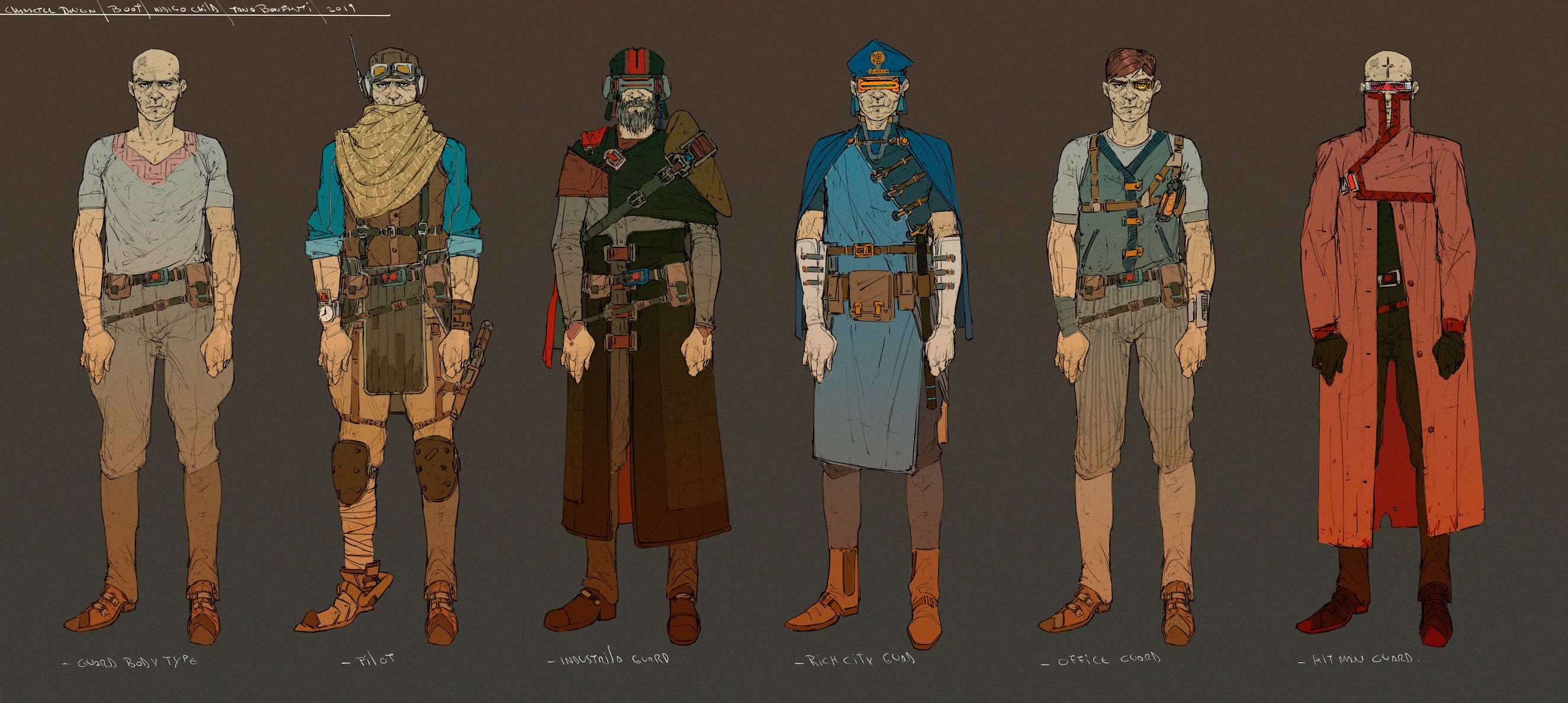
Another key part of being a character designer is character iterations, being able to come up with a large amount of variations for character designs of characters of the same class is key. I love how each one of these you can tell their level in the hierarchy with the rich city guard and the hit man guard feeling like they are the two at the top of the list. The designs here are for the most part widely different from one another although we see similarities in the overall designs.
For example we see diagonal lines used in the first iteration and some variation of this used in all of the other designs except for the final one. In the second one this use of diagonal lines across the waist is contrasted with longer vertical lines that cut across the body, on the third and forth we see the lines across the waist become straighter while the diagonal lines is instead expressed in the large diagonal line cutting across the third figure and the fourth figure has four smaller diagonal lines and 3 horizontal ones on each arm to diffentiate it even further.
In the last two we see this merger between the use of lines throughout the previous ones, we see a holster that cuts horizontal, diagonal and vertical and the vest and waist of the also have a slant to them and hold opposite sized things on either side creating a sense of balance. The final one we see has stronger bolder shapes that then cut across the chest of the figure in one swipe.
Other things I noticed was the rich city guard is much more symmetrical than the others. We see in his design outside of the use of the diagonal lines on the left side of his body we have a mostly symmetrical drawing. Things even feel very rectangular with the optics on his eyes, the stripes on his long sleeve gloves, the piece holding his cape on, the packages around his waist.
The industrial guard also has a lot of symmetry as well however he also has more variety in terms of values in colors, and obviously contrasts in terms of color temperature with the rich city guard. The office guard feels like he is the furthest thing from the other guards since it takes all the elements of line and goes in the opposite direction. For instance the pants are all solid colors in the other pieces and here we see they are pinstripped and this contrasts and layer cakes nicely with the gun holster, the items on the gun holster and his vest. Even the bandages on his arms have some contrasting line work going on.
For more of Tano's work check out here


Comments
Post a Comment