Tona Bonfanti analysis #3
Shape design
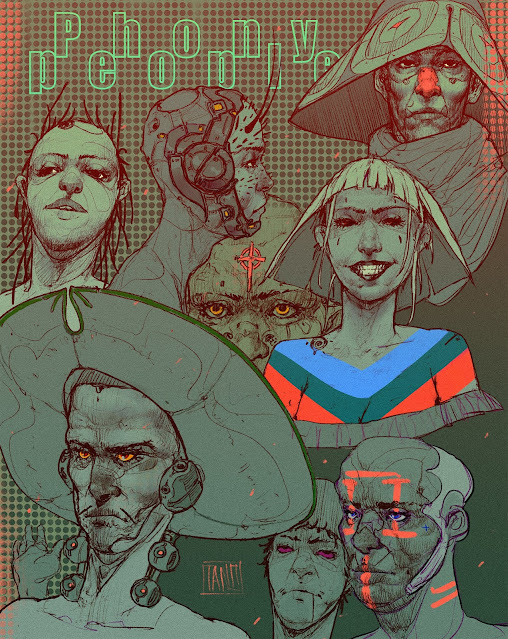
Excuse me for a moment while this blog becomes some sort of crush on Tona's work but I find the use of shape design and rendering in his pieces to be especially beautiful and something I want to incorporate into my own work. What Tona's work accomplishes so well is the simplification of shapes and the organization of those shapes that make it so much fun to look at. We see what would otherwise be very complex shapes such as the weird robotic parts on the guys neck and head on the left and simplifies them into very simple and well designed shapes that give the vibe of a cartoonish feel yet rendered.
I also love the splashes of very vibrant colors on mostly desaturated monotone characters. This play between monotone gray scale green with highlights of red and blue make me think I can incorporate something like that into my own traditional work where I mix vibrant markers with desaturated blue. Something to make note of.
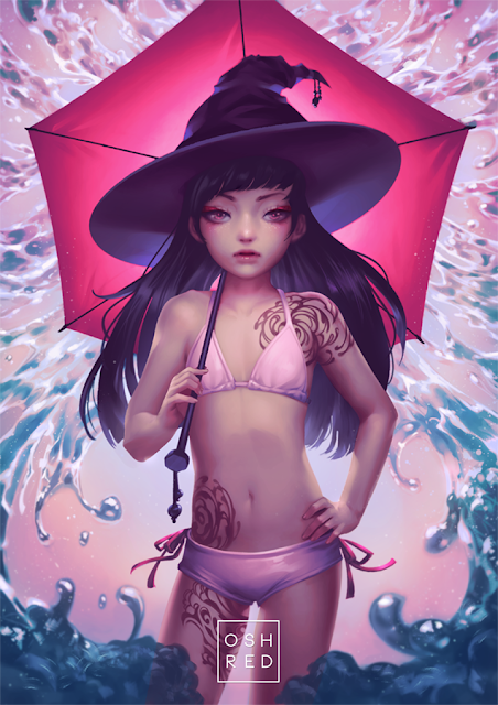
This piece which I imagine that started off as a random sketchpage looks like the cover to a psychedelic space adventure comic. One could imagine this piece going in the direction of a book or comic cover if he wanted it to. Here again we see an expert level understanding of shape design and layer caking. On the shoulder pads of the character we get big wide open shapes contrasted to the very small lines that help organize the shapes.
The figure in the foreground contrasts to the other shapes in the background because she is so triangular while the shapes in the background have long rounded forms and circular forms to them. I love the use of red in this piece how it cuts across the page like the radiation lines from the sun illumination or maybe laser shot from other space ships off the page.
We see a clear organization of these red shapes with the biggest ones in the bottom making them the foreground shapes and they get smaller in the background and another large one on top that frames our view of the image in a diagonal way. The top right side of the image is interesting because its so contrasted to the rest of the image. It has a dialed down warm tone to it that contrasts against the foreground but the value range is similar enough to the background that it fits on the image and doesnt draw too much attention to itself.
The writing is also interesting to me we get the sense that these are closest to us since they are written in more vibrant colors and are obviously layered on top of other parts of the image.


Comments
Post a Comment