Patrick Brown Analysis
If youre new to my blog let me introduce you to another round of 30 analysis of artworks, this time Im focusing on illustrations with some character designs thrown in as well. I'll be doing some sketches as well as taking notes to help me get a stronger idea of what is going on in some of these awesome illustrations. I'm always looking to improve faster and faster, looking to discover new ways to improve by looking at and studying artists I really enjoy! Today is Patrick Brown, and if you would like to check out my current work click here.
Analysis: Master thumbnail study
Challenge: Can I create the thumbnail version of this piece within 10 minute timer and if not what could I prioritize in order to get it done faster?
Result:
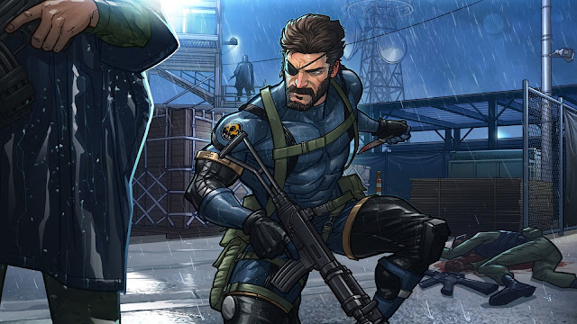
This is how far I got in 10 minutes of doing a study and what it makes me reflect on is that I could have gotten much further had I thought of the illustration itself as a series of layers and done each one on a different layer to begin with, instead I tried to lasso tool my way around the piece and what I realized was this has led to a lot of clustering of shapes and shapes that lack design to them.
Round 2
Feel like I got much further along this time in the second 10 minute sprint, focusing on trying to use layers to suggest lighting right out the bat which will help make the decisions later easier.
Somethings I noticed before I end todays round of the master study and continue working on it in the next one.
Lighting. Its best to think in terms of layers of what you want to stick out in the very back, for example he uses light behind both the central figures and the backdrop to push each one successively forward. For instance the light in the very very back we only see peeping out of the side of the building in the background over snakes left shoulder but this light is enough to keep the backdrop from looking too flat and keeps the sky in a nice gradient.
We see a similar thing here with another layer of light inbetween the background elements and the foreground element. The figure laying dead in the midground is unaffected by the strong light that catches out attention over the other guards shoulder illuminating both snake and the guard giving them both a glow that pushes them out of the midground into the foreground.
Overlap. This piece has a lot of overlap, nearly every element from the foot of the shoulder on the background behind him to the figure laying on the ground to the many objects in the background there is a lot of overlap which helps communicate the perspective of the image.
Gradients One could theoretically do all of the major objects and forms in each area of the piece in a sketch fashion and then go back in and lasso gradients on top of each element, stacking them back and forth in different directions to where they agree with one another in a rhythmic harmonious way ( one going down., the other going up..etc.
Tomorrow I'll be pushing the next 10 minutes of this study to see where I end up after each 10 minute increment and what I could improve to make my process go faster.


Comments
Post a Comment