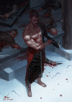
For this one I decided top approach how I would break this image down and analyze it alittle differently.
To start I took the image and did a form tracing over the main figure in the image focusing mainly on the arm and the forms of muscles here I wanted to see if I changed the direction of the light and color of the light slightly could I recreate these forms with slightly different lighting.
I also went ahead and broke down the perspective into a basic 2 point perspective grid and then carried this over into my own piece after drawing yet another form grid over my sketch of the character. What I originally wanted to do was have the orange color coming from underneath, while the blue color comes from the sky like noted here. I noticed as I began doing this that my understanding of form and how to light that form is not as good as it could be and will definitely need help. Especially when it comes to drapery.
Above you can see my attempt and you can see I focused mostly on his upper body. What I did not do correctly was the values.
Lighting and Values
Here we can see my organizing of the values leaves something to be desired. In his piece there is much more gradiation of values from one grouping to the next and there is no stark black value to be found in his, they all exist in a darker value but not completely black. In his piece its easier to distinguish the kind of lighting scheme he goes for by focusing on a key light light setup. Key light shots create sharp shadows that cut across the form dramatically. Here I have the shadow on his chest cutting too dramatically in the wrong direction. I wanted it to cut diagonally.
Process
The process I used is similar to the one that Lynn Chen talks about in her painting light video that I recently watched. Basically she starts with a sketch then blocks in color for each object in the environment and then clips and locks layers for each element so they can be painted individually this helped especially when doing the tones of the shoulder without wanting to get rid of the hair shapes that sit there.
For more of his work check out his artstation.


Comments
Post a Comment