Composition, color and value analysis
Composition Color and value
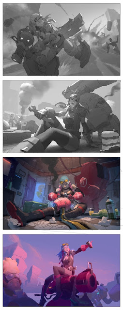
I wanted to use this series of images as todays analysis because I was struck by this artists use of value shots of images that look so good and clean. The color images also looked solid from a construction point of view so I wanted to see if I could understand a little bit more about color comp and value by comparing the way this artist organizes their values and colors in space.
The first thing I noticed was that the darkest values seem to sit at the front of the page. In the first two images we see the figures are coming off the page toward us and this cropping of the leg and the air motorcycle she is on gives us depth but it also acts as a anchor point for the values since as we look further behind her we see the values get lighter due to atmosphere.
the first image even feels like the front of her has a gradient of darker value lightly brushed over her but what is also important to recognize is that the figure still falls into midtones, its not overly dark or overly light. In fact there are only a few light spots found throughout the image as the light hits the side of the character we can see the light shapes are basically white shapes that match the plane of the object they are cast on with the exception being the back leg which has a more diffuse light cast on it since the light curves around the form of her leg.
We see a similar thing going on in the next piece with the darkest parts of the image being in the front with the back of the image being lighter. The lightest points mostly just hit our focal point and its important to notice that each object in this scene has its own value in light and shadow.
IN the bottom two images its easier for us to see that there are much darker values used in the illustration than in the first two. This would be because the contrast in the inside shot is higher since the value of the sun is not as strong. In the second image there is a slight gradient across the bottom of the image which makes it feel like an overcast day, a shadow of something is pushed over the shape of the figure in the foreground and the weapon she sits on. Again because of atmosphere the background is lighter, which makes it easier to group these values together.
An important takeaway from this in terms of value is that you do not necessarily need the full value range for an image to work, but most things will still fall into the greys. Also while this might be true on close inspection of the values you will see that there is still variation in the shadow itself. They are not just one blocked in shape of value, they have a gradation. The first image is a good example of that, for instance the shadow on her is definitely a gradient, the sky is as well (notice its not all white because blue can still be grey) and notice the light bouncing off her thigh is catching onto the fun holstered on her back creating another gradient.
It looks like the artist is using a textured brush for the figure in the foreground of the second image while the background values, while still being used with the same texture brush has less variety and depth in the values.
Color
The color palette on the bottom two panels shown here have very different palettes from one another since this is basically a comparison between an indoor scene and an outdoor scene. For instance since the light cast in the second piece is so warm we see this reflected in the colors throughout the piece. Most of them fall into warm tones of pink purple and red. There is a stronger unity in that these colors all feel warm together.
In the indoor scene when we look at the palette off to the side we see it actually has two different light sources. One that is dropping down on the girl which is a warm light. This warm light helps push the figure forward while the background falls into shadow but is also illuminated by a cool light coming from monitors off screen and in the background. So there is a good play of warm and cool shadow colors at play here. To save time I only broke down the colors of the outdoor one, but I extracted the colors for the indoor scene to give us a idea of how the colors look beside one another.
Composition and form
Here I've taken some of the basic forms and constructions of the composition and traced them out to get a better idea of how this artist put together their forms. What I noticed immediately is that there is a heavy use of two point perspective in each piece with the first one feeling more like a one point perspective. Some other things to note is that big shapes and values, like in most pieces I analyze are grouped together around our focal point. For example the mech, cannon and suit armor are all directly connected to her or are close enough within her silhouette to basically make them all one shape if you were to break the values down and group them into only 3 values.
Also notice that on the bottom 3 the horizon line sits low on the page while in the top one it sits at a medium height which gives me the impression that this is one of the signs that tell us that this might be a consideration for future pieces.
\


Comments
Post a Comment