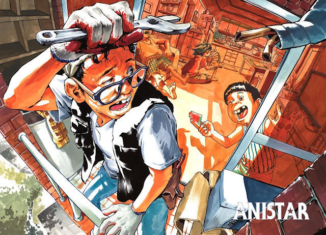
Anistar illustration analysis
Again I couldnt find the exact artist but more work from Anistar can be found here
Perspective and composition
Another 3 point perspective piece for today, why do I think its 3 point? Because the top of the plane of the shoulders of the man for example are visible to us allowing us to see that the top plane would be more curved away from us if this was in four point with the figure this close. In four point this image would look more bowed out going up. A parallel you can draw between this piece and the other pieces I've analyzed recently is that you can usually find some cylindrical or box like shapes towards the bottom of the image that turn very dramatically in perspective moving closer to us to where the ellipses of the cylinder almost overlap. We could see it in yesterdays example with the bullets on the rifle of the first person view and here we see something similar in the cylindrical shapes of the guard rail.
The guardrails that point up to the man dont overlap but they really sell the three point perspective since their receding side is so drastically smaller than the top shape. In some ways they feel out of proportion or its at least clear to us that this part of the image is distorted by our view of it. The rest of the body specifically the top half of the body feels well proportioned although it is coming up towards us. Notice that even though the left hand is further down in the image it is not distorted heavily.
It is shorter though than the upper arm but it feels proportional and I think a bad habit I would have in a perspective shot like this is I would be too ready to overlap the ellipses rather than shorten the distance between the ellipses. Keeping something in proportion seems to be about that.
In this perspective shot there are many commonly used techniques to direct the eye. One of which is leading lines. If we look at the leading lines of the image we can see this in the brick layout around him, the tiles he stands on, the position of the cupboard and boxes around him they all point backward. You can notice this by tracing over some of these lines and following them back to a central vanishing point on the page.
Another quick mention is how the two heads of the man and child compliment one another in their perspective. I think this makes it a much more dynamic image and it was definitely something he probably thought about before. In blue I marked the facial features and where they fall, notice the tilt off the head of the figure in the foreground the nose and mouth are close, while the eyes are further up. Now look at the child's face and we see it is the opposite, the mouth takes up most of the face and the nose and eyes are very close to one another.

Value and color
The darkest values in this piece are found where we would expect in a image that has a lot of depth: in the foreground in the vest of the guy and the hair and face details of him and the child. The shadow shapes and the contrast go hand in hand here in that he uses the dark value of the jacket to show us the high contrast environment he is in. The choice to put his jacket in pure black and a lighter value only makes us feel the heat in the image. We have again a nice use of leading lines in the shadows of the guardrail that fall on his leg and join the other shadows further down around the page and the line of the shadows of the screen door and wall.
Here I've broken down the palette and drawn my own palette from it above his, my ability to recognize color has definitely improved tremendously! However my mistake now is not seeing the subtle changes in color, for example on my grey (5th color from right) His has more yellow than orange in it. All the other mistakes I've made are a matter of not adding enough saturation, but getting close to being right.
The color scheme here is really very beautiful but simple. We get the feeling of warmth carried throughout the whole image with pockets of cool shadows such as the cube and space behind the wall to his left. The shadows behind him and on him are warm while the shadows on his shirt and pants feel much cooler. I just gotta give this guy props for putting in these beautiful orange colors and contrasting them to the blues and greys that appear blue in the foreground, really nice subtle use of color contrast.


Comments
Post a Comment