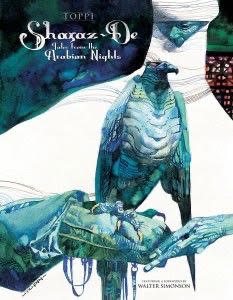
Sergio Toppi cover illustrations
Composition
I wanted to pick acouple of pieces from Sergios huge body of illustrated books and talk about the composition in these because I find them to be so dramatic and interesting. Below I speak about each one andd break down the composition into a thumbnail to understand it better. First up is looking at some of his color work. Here we can see it follows a very similar layout to his black and white images with the strongest colors being contrasted to a white background.
The value grouping in this colored piece is again very similar to his black and white pieces with the greys and darks all mostly grouped together. There is a nice suggestion of form with the bird falling in and out of the light that is casting down upon it. IF we look at it in terms of being four quadrants we can see the top left quadrant pushes us to the side enough to not only make room for the text but also to give a very dramatic white shape that falls off the page on all sides.
This allows the arms of the figure, the bird and the triangular shape of the face become the clear focal points. We can see the bird is our central focal point and the face contrasts against this point both in size and shape. The bird could be said to be triangular as it stands straight feeling very powerful, the face feels stoic and less important.

This next comic cover is interesting to me because the text doesnt seem to either be something that he thought about when creating this because it falls in a place that I would think is awkward for the drawing.
Regardless we see a similar situation here where the values are grouped together strongly as one form leads into another and other forms such as the arm on the bottom pop out of the black silhouette.
I love the way he has these very flat characters with pattern designs on them to differentiate them from one another. But he also merges several forms and bodies together through similar lines and shapes. For example in this piece we can see how the female figure in the background and the sleeve of the womans dress in front move together along the same curved path to form two different shapes the arm and the figure. We can also see this in the clothing the middle figure wears which joins the midtones in her clothing and all the figures are differentiated from the foreground by dark blacks.
As far as the color the color is very simple and chaotic with te foreground figure being more in a light cool blue and the figures in the back in darker warmer tones pushing them back in the composition.


Comments
Post a Comment