Book cover analysis
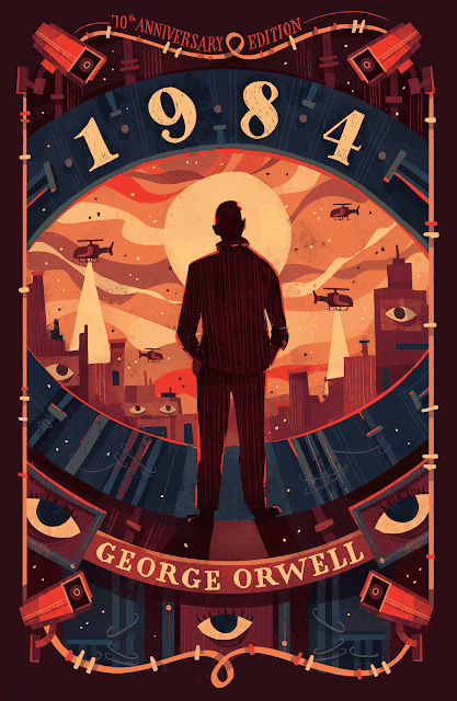
Moving away from comic covers for a moment I wanted to take some notes on this awesome 1984 cover. What I appreciate about it is how cleverly the main icon of the eye is worked into each and every part of the design. we see for example the obvious eyes that look and point with their placement up to our main figure. We can see similar eyes on the building that look almost like cut out pasted paper as they look up into the sky as helicopters cruise around in the air.
Notice that the two top helicopters are going in the same direction and only the one close to us has a searchlight on. Also notice the two bottom helicopters are ongoing in the same direction as well with again the closest one having the searchlight. None of the helicopters are level with one another and are at varying lengths close to us. Interestingly although the helicopters have some scale to them the city below feels very flat, we dont see a lot of overlap of buildings in the background outside of the fact that the buildings on the far left and far right are the closest to us and they overlap buildings behind them in a simple fashion as it goes backwards into the horizon.
Color wise it feels like a lot of the color variation in the sky in front of him are all of a vvery similar value which adds variety while at the sametime keeping the colors in the same range helps organize the image better. My favorite part though is how the silhouette of the man and his head basically become the stand in for the pupil of the eye that the city is sitting in. Again like i said before we have all manner of eyes in this piece and this subtle edition to the cameras and literal eyes with the overlap of forms to create the illusion of another eye is just really fantastic.


Comments
Post a Comment