Art of JPH analysis
Composition
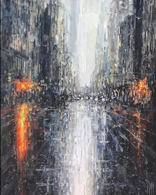
Today I've decided to analyze a piece that I wanted to study for an issue I've run into on a recent painting. That is the way one can create the feeling of a rainy day in the form of painting strokes. This is something that I've found to be really difficult and jph has masterfully accomplished this in this awesome street scene piece.
To start with we can see the image is for the most part comprised of strokes that go downward, there seems to be a clear distinction between what is the sky and what isnt half way through the page, the page feels cut in half nearly right in the center, with the ground taking up a little more space. The top p[art of the piece is comprised of mostly vertical marks with some horizontal marks made for the buildings railings but most of the more pronounced horizontal lines and marks are kept for the bottom of the image. The bottom of the image also feels heavier since it contains more value information from the reflection than the top of the image.
One such strategy for creating reflections seems to be to exaggerate the value light or dark source that is being reflected. For example we can see on the left the light source being reflected is not nearly as long as the reflection itself. The reflection is much loner and it could be broken down into concentric circles or areas of color. In the center is the lightest value which is closest to white , it lays on top of a broad swatch of yellow and this yellow is surrounded by orange and reddish orange marks that fall away into the darker values on the street. The sky is also represented as reflecting off the street itself as we see these broad white strokes that cover the whole piece, only interrupted by the middle of the image where the cars are.
While the image feels very abstract there is a strong sense of perspective in the image as the floor at the bottom feels the closest to us and it recedes into the background very clearly as we use leading lines to point us back to the horizon line. Meditating on the colors a bit more we can see he uses flicks on color to communicate rain drops on the ground, and the buildings themselves, as long as the perspective is right can be loosely down with various forms of value and color to really communicate the feel of a rainy day.


Comments
Post a Comment