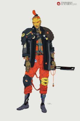
Calum Alexander Watt Analysis
I picked this piece as one of the first pieces to analyze during my Robotpencil mentorship because I feel like it really sums up the style of art that I want to go for. I love the tribal feel mixed with a cyberpunk flair, its gritty but at the same time colorful which adds to that element of contrast of taking something that isn't traditionally seen as something that would be colorful and adding that element to it that gives it an almost psychedelic vibe.
Design: counterbalance and layer caking
If we look at the way this artist has organized their shapes we can see a clear hierarchy and organization that leads our eye through the piece by putting lots of small shapes layered on top of one another near bigger shapes that are our focal point. Our focal point is the wide open shape on the face that is surrounded with smaller shapes of the jaw (as well as the 3 points on the head), jacket and shoulder pads that all sit around the face shape. We also see the artist take the approach of making an X over the body that we see so many times in character designs and changes it up to give them a little more visual interest by adding some overlap with the jacket and not making the X shape so obvious.
We see then as we move down the figure that we have a high concentration of small and medium shapes at the shoulders it then widens out to bigger shapes in the mid torso area and then we see a return to smaller shapes in the extremities of the hands and feet. The medium shapes of the leggings keep the design interesting and keep it from looking as wide and open as the jacket, otherwise they would be competing and it wouldn't be as interesting.
Contrast
The first element of contrast I see when I look at this piece is the contrast we see between the bright colors of the pants and face of the figure and how this contrasts with the more grayed out blue and green of the jacket and the shoulder pads. The jacket she is wearing is also a big wide open shape that doesn't have much in design other than two big strokes of a darker blue grey that segment the parts of the jacket. Other than that this area is only loosely decorated with some stickers or patches but all of them recede to close to the shoulders or below the waist line.
Why is this though? I believe because the contrast of the plaid shirt she is wearing would not work otherwise if there was things in its immediate surrounding that could compete with it. Likewise there are other contrasting elements like the mismatching knee pads and the duller grey greens of the hands.
Repeating shapes
Throughout the design we see a couple of interesting repeating elements and shapes. One of which is the triangle. The triangle is found all throughout from the button patches to the design on the knee pads and the negative space of the knife she is holding. We see another similar repeating shape in the oblong diamond like shape that is found throughout the piece. Its all along her pants and then we see this similar shape on the yellow shape of her head. Its not exact but it does have found corners like a diamond and it helps her face really stand out and pull the piece together cohesively.
Leading the eye
I also think that there is quite a lot of ways the eye is lead around the piece through the flow of shapes. Notice how the shoulder pads on her right angle upwards pointing towards her face and how the opposite side creates a downward like curve that repeats along the tire and moves our eye down the arm. We could also say this for the X like shape on the figures chest, which almost blocks off this area of the design, but we could also say this for the jacket corners pointing up to the face.


Comments
Post a Comment