Character design analysis: Edward Delandre
Character design notes:
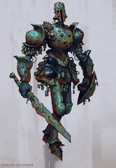
The first thing I noticed about this piece is the cartoonish use of shapes in the piece. We can see that the shoulder armor pieces feel very cartoonishly exaggerated but are using straights to convey this cartoon feel which is interesting. When I look at the shape design itself there isn't very many curves anywhere in the piece really instead we see many small straights that give the impression of a curve which gives it a very odd look that reminds me of early PlayStation 1 games.
As we look for the shapes that unify the piece we see the chain mail represented in the form of squares as one possible option. We see the layering of small shapes underneath the big shapes of the shoulder pads. We see these same shapes at a slightly bigger size around the waist of the figure and one could argue the plates underneath these smaller shapes are of a similar size.
There is also circular shapes we find all over the piece that are in varying sizes, we see for instance on his forearm armor the medium sized circles and hoe this contrasts with the circle shapes on the shoulder armor and the chest arm and form around his next in smaller sizes. The head then is covered in medium circle shapes.
Another interesting element of this design is the rustic color that is accomplished by mixing a dark desaturated orange and greet together giving the impression that this soldier just walked out of the ocean. We can see the head of his enemy on his belt and know it to be his enemy since it is a completely different tone nd color scheme than him. On one last note with this I love the use of negative shapes as well as we see the shapes of the arm and waist stick out creating some interesting asymmetrical elements. The negative spaces have been designed just as explicitly as the shapes themselves.


Comments
Post a Comment