character design analysis #24: Paul Richards
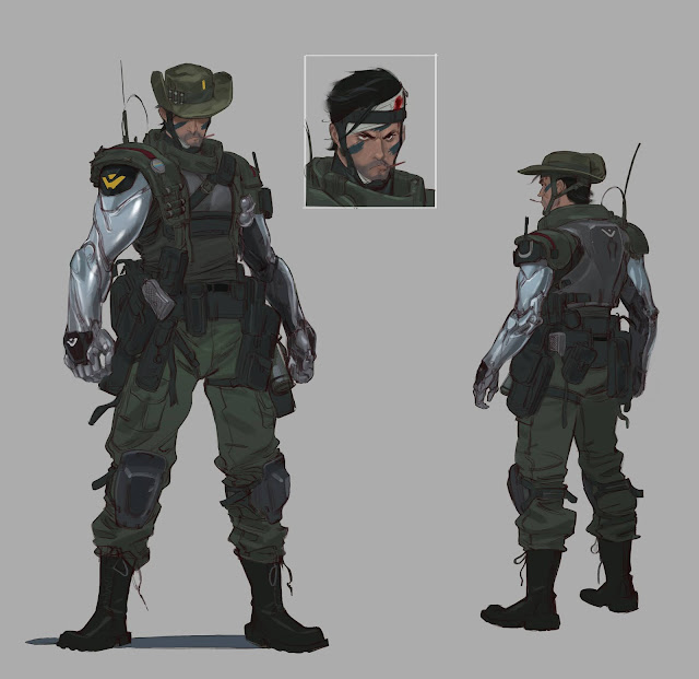
Really good use of layering of different elements going on in this piece. We see the figures detail is mostly centered around the midsection of the figure where all of his equipment sits on either his hip or along his shoulders and gives a asymmetrical feel to it as his right side feels heavier than his left. Color wise this piece is all within a very desaturated range outside of the metallic arms and touches of yellow and his face. This helps these elements stand out more.
I love the use of shapes in this piece, the way the folded shapes cluster around the bottom half of his legs and the thighs are more open in shape along with the boots. Paul richards also does a great job of showing how the figure would look from behind and I noticed here that with these two views alone hes given us most of the information we would need to model this figure. Other things I noticed was the repeating symbol shape that is on his right arm but also on the back plate of his armor but in a different shade of color.
The rule of 3 is used throughout the piece with the symbol showing up again on his wrist plates and then we see the ammo on his body is also sorted into groups of 2 or 3 with bullets on his right shoulder and on his cowboy hat adding up to 3. Looking at his face we see the face paint is also coordinated into 3 shapes that mark around the facial features.


Comments
Post a Comment