Tano Bonfanti Analysis
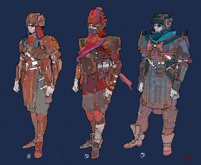
Looking at some more pieces from tano I wanted to make some notes about these because they all feel very asymmetrical to me and feels like there is a lot of layering of interesting shapes and design throughout the pieces. For example there is some interesting use of white throughout the image with lines crossing diagonally across the figure connecting bigger shapes together and framing the many holsters on the first figure. I like how these lines then converge and get tucked away into other forms and other layers of shapes.
While the first one feels like a typical guard robe the other two feel more empirical in some ways. All of the characters share similar shapes, they are all very square or rectangular shaped while the second one has more of a triangular like form to it with the somewhat pointed hat and shoulder pads. We can see a pretty wide use of different ways to interpret these shapes with the guy on the right almost looking like a football player or astronaut with the way the shoulder pads come up and eclipse his shoulders and neck.
While the middle figure is covered more in a cloth form and we can see a use of asymmetrical design in the use of the bandages on his leg. Actually both designs in the middle and right are both asymmetrical on the legs. All 3 generally have the bundle of shapes that are similar to one another in the mid section and above on the figures and dont have a lot of detail on the thighs.
If you would like to see more of Tano's work check it out here.


Comments
Post a Comment