Cheng Wei Analysis
Well what originally was going to be a daily posting starting back in November got pushed back because of freelance. Today I'm restarting it and Ill be sharing my study process and thoughts on this Cheng Wei piece.

What I also notice is that its better and easier to use the lasso tool to break all the shapes down rather than to spend the time trying to manually paint every element. Instead use the lasso tool to break each individual shape down and then from there you can blend the shapes together to lose the edges if need be. This method helped get the shapes down quickly although some of the shape sizes are not correct.
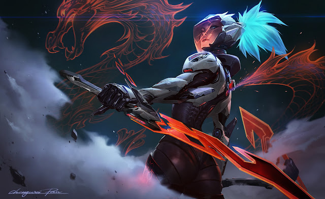
Composition
The composition is skewed leaning to the right slightly with the character underlined by the strong foreground element of the blade that cuts across the page horizontally moving in the opposite direction of the character. All the main elements in this piece are very horizontally drawn from the small light details emanating from her wrist to her body, arm, face, and blade and of course the dragon.
The composition also has a strong S curve loop that carries our eye back to the figure over and over. For example we see the figure then we see the protrusion on her back that the dragon is coming out of. Notice that it curves behind her intersecting with her silhouette horizontally before curving back up and towards her again.
Notice that even the scales or hair on the back of the dragon have a general gesture in her direction and even contrast in direction to the scales on the front of the dragon.


Value
Value is the foundation of color and if we are to break this image down into just the value we can notice a few important things. For one notice that even though there are many illuminated light shapes there is not a lot of pure white in this image. For the most part we see the image exists mostly in a grey zone of colors like most painted images. The figure herself is darker than the gradient background she is posed against but not so much that her hair doesnt stick out from the strong black background gradient on the right.
Notice the dragon is less illuminated than she is which is counter intuitive to what you would think when drawing a hologram like this. Most of the light shapes are left to show the changes in the planes of the head and the armor of the top of her body with some of the white also being used on the blade to show changes in the plane shift giving it a very unique look and design.


Comments
Post a Comment