character design analysis
Flow, Shape appeal and character design
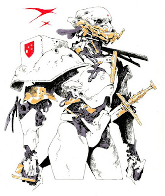
Today I wanted to switch it up and just talk about a couple of principles that I wanted to refresh my mind about for character design. One of the key elements of good character design is having a good flow of different elements that all go in one general direction. The key to creating a good sense of "flow" in a shape and in a design in general is to know where the shapes are tapering to.In our anatomy there is a basic tapering effect as for example our arms go from wide shoulder and deltoid shapes down to the smaller shapes of our individual fingers. Here we also want to mimic this or play off of this in our designs. For example a good shape tapers in the direction the eye should go. So we look at the forearm shapes here on this character and we see the top portion is squared off and has minimal points where the eye can flow other than going straight down to the wrist.
We also see this similar shape in the way the shoulder pad tends to tapper downward, the chest plate also tapers downward and breaks into two shapes. We see then that this is a natural stacking of big medium and small white shapes going along the arm. We also see this contrast of big shapes next to small shapes in the way the big white shapes are wide and have only slight indications of form change in the way of crosshatching and these contrast against the smaller more intricately detailed darker shapes that hang our underneath the white forms.
The gold shapes also contrast against the other two groupings of shapes here being a mix of medium shapes with an intricate design. And we get one of the only organic like shapes taking place in the cords hanging down from the mask element of the head. I'm not sure of the artist, but if you know who this is please feel free to drop a link in the comments.


Comments
Post a Comment