Dao Trong le analysis
I wanted to take this piece and see if I could break down and understand it from multiple ways that I learned to analyze my own pieces from the latest webinar from Nielson's "Magic of Contrast" workshop from Schoolism. Here are my notes.


Here we see in his next move he breaks down the image further into different color schemes. In the sky I noticed in the video that he has a variety of color in the sky from blue to orange to red and brownish purplish colors but they all blend together well to communicate a sky because he keeps them roughly at the same value range and once he picks one color and its value he just moves the scale around to select his next color but keeps it at the same value. We also see that he has taken the building layer and dropped in a grey blue in this part and is now adding in some colors of orange to help contrast in spots where the sun would be hitting.

At this point he has dropped in his flats on his greyed figure in a clip layer and has pushed the background around and brought in some dull oranges for the swoshes in the front of the image.

Only acouple of minutes into the video and alot has happened. We see other elements that contrast to the original layout have been added. For example it is only slightly seeable here but we can see the use of rain that moves diagonally from right to left across the page faintly and then diagonal lines moving in the opposite direction in the sheen of the ground towards the other side of the image that communicates the rain effect of the image. The darkened buildings around it also help but is really sold by the reflection of the buildings in the ground. that is accomplished with a brush that is set to a low opacity and streaks downwards. Already we can see multiple levels of contrast in this image in terms of diagonals, it feels like many layers of diagonals going back and forth.


I skipped through most of the rest of the piece to where he starts to draw in the water to see what they are doing, which it looks like this is a simple smear technique that is being used to create this effect. The rest of the main speed painting video can be found below:
Key takeaway: contrast is everything
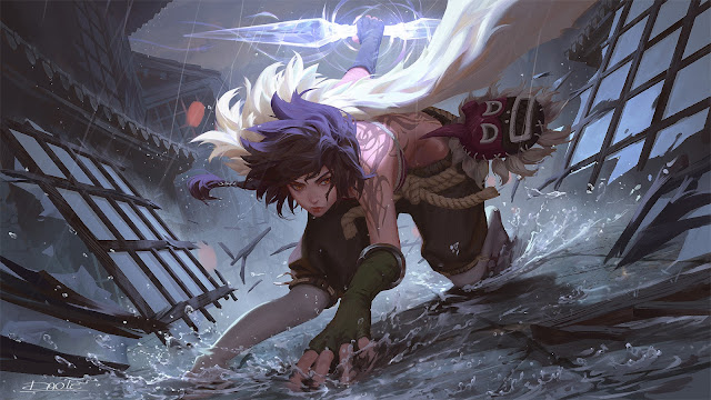
Sam Nielson recently had a schoolism talk where he talks about Contrast being the key to everything, I decided I wanted to break this image down and understand it just in terms of contrast and see how many ways contrast is used to create a really compelling image. So lets look again at the image

Straight vs curve
We can see the use of straights in the perspective lines of the environment that all point us back to the figure, whether that's on the broken pieces of the wall, the buildings to her right or the lines on the ground, all of these contrast to the curves in her design. Within her design we can see familar straights vs curves such as in the shape of the leg or arms. The shapes on the pants are contrasting shapes of straights and curves.
Hard vs Soft
We see this in the metal bracelet on the arm for instance or the hardness of the shapes around her versus the softness of her hair and the flowing white shape attached to her back.
Even Vs Uneven
We see even shapes in the spacing of the tiles and such of the wall and the buildings and floor, they are all equally spaced in a pattern and this contrasts against the more dynamic and uneven shapes of her body posture.
Warm vs Cool
Interestingly the colors that are the most vibrant are actually cool and the shadow colors fall more into the warm color spectrum however the value determines whether they identify as warm or cool. For example the staff behind him is clearly warm because its emitting light but this is the higher value ranges of blue where as the shadows on her are in the duller greys of red and so forth.
Light vs Dark

Breaking the image down into a threshold image of light and dark shapes gives us a clearer view of how dynamic of a piece this really is and also gives us a chance to look at the shape design of the negative spaces.
Big vs small
Big vs small can be seen in the hair vs the long flowing cape like object on her back in this black and white version but it can also be seen in the negative shapes. Notice that along the ground we have 3 small to medium light shapes that go diagonally across the picture. Notice also that as these shapes get bigger on either side of her they help carve her silhouette but they themselves are also subdivided with smaller details of debris that help break these parts of the image up. We also see this on top with the large black shape of the figure below being contrasted against the big white shape above.

Rest vs Detail
We can see this dynamic in the detail of the rain hitting the ground around the figure and the detail of the environment in the midground vs the flowing grouped shapes on the figure itself. We could also see this in the contrast of the rather bland designs of the pants, leggings and overall clothing vs the tattoo on her back. Notice this is what gives it that slight anime feel, the world is in some ways more defined in a render than she is.
"Make sure to contrast any division in at least two ways"
This is a piece of advice that Sam gives that I still struggle to understand fully but I assume he means that each element in a piece should be affected by another element in at least two ways. For example the debris of the doors pointing us back are subdivided from the rest of the image in their overall more dynamic shape and they are lit from the staff unlike the background.


Comments
Post a Comment