Lyn Chen process analysis and notes
Not too long ago Schoolism had Lyn Chen on for a webinar when she gave some useful information about her process and I wanted to reiterate that here along with a brief analysis of the piece above. First though lets look at some of the notes and information she provided.

One of the most powerful tips I heard her come up with was to use the lab color A to be able to pick colors that are contrasting to one another in the same hue square so youre picking from a variety of mixed colors. What you will notice is that this sorts colors to be cool on the left side and warm on the right.
She starts her process with a sketch and then begins dropping in her colors starting with flats but also incorporating the above technique to start putting colors of similar values right next to one another to make things pop. This is something that Nathan on Schoolism talks about in his painting with light and color series. That two contrasting colors right next to one another of the same value give the image a vibrancy.
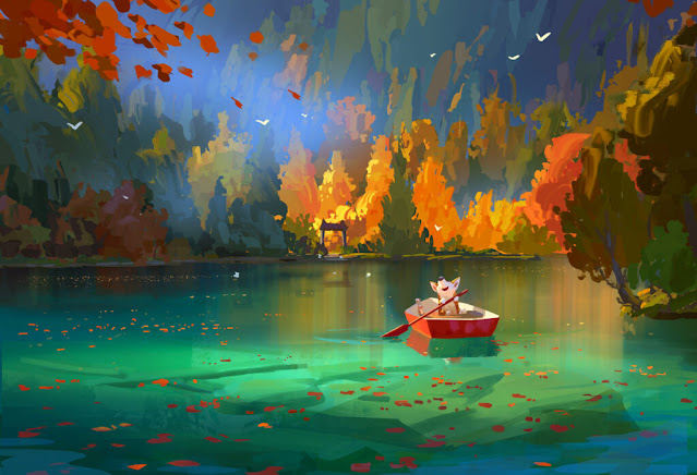
Here in this piece we can see this principle at work in a couple of places. For instance in the background far distance we clearly have many colors mushed onto one another that are all of a similar value range. Here I went ahead and dropped this image into a grayscale to show what I'm talking about.

We can also see a rhythm of values starting all the way in the back with a medium dark grey that is lost into the distance and then we have a break with some trees that are lighter before we get to the trees closest to the bank of the water that are darker than the ones in the distance. Then we are introduced to the massive shape in the center of the piece which is the body of the water that starts out dark far away from us but gets higher in value as it gets closer to our character.
We have the tree shapes on the right and the top left to break up the foreground and midground space there as well and the tree in the top left leaves fall down towards our character. There are many leading lines both underwater in the rocks and also on top with the leaves that are plentiful in the foreground and to the left balancing out the strong pull of the character on the right.
Another powerful tip she had: to tile the workspace into a greyscale view and your color workspace so you can look back and forth and technically paint in color but only see in black and white. She does this by proofing the image in black and white in one of the work windows.
This is another image where we can see the strong use of contrast, our character is in a big vs small and then we see this echoed in the trees vs the leaves. The piece is subdivided along the line of the shore and although I did not make a grid for this one I can imagine that she was thoughtful enough to not let these different quadrants feel equal to one another.
I have in my notebook a few random tips that I'll just leave here for future reference:
1) When looking at a piece try to identify what kind of lighting scheme it is and think about this when you're painting your own is it: Key light, ambient, natural or bounce. (This looks like key to me, I'll be getting into this soon).
2) Bounce light is the soul of the painting
3) Bounce light becomes slightly warmer as it goes towards something so make the color slightly lighter in value and color it slightly the color of the environment it is in.
4) Darker objects creates less bounce light
5) Cool light color in the sky will influence local color for example if the sky is blue & the local color of the grass is green, the green should skew slightly towards blue.
6) she takes inspiration from reference for both literal location reference and mood reference. She uses her character to place them in different scenarios
7) If the scene is nighttime the colors should reflect this and be slightly darker and tilted towards blue.
8) Always collect reference for color and lighting to help find a mood for a piece
9) If bounce light is warm, then sky light is cool or vice versa play off of them.
10) reiterating what I said before local colors should fit with background so pick different colors or overlay the color and select multiply to knock them back and make them fit together.
11)Make your edges tight near your focal point and loose everywhere else
12) Bristol brush is good for hair
13) 1st layer is warm colors, second is cool, 3rd is blending the two.
14) She recommends watching the tonka house and nathan fox schoolism courses as well as doing plein air painting for improving color


Comments
Post a Comment