Toni Infante analysis
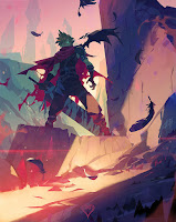
looking at this image we see a few things that jump out immediately: For one the figure is the centre of our attention however it is not front and centre in the image. The figure is slightly off tilt to the side keeping this from being a boring image.
We are lead into the image of him by following the floating pieces of feathers from the foreground to the mid ground to him where his silhouette is cut out from the backdrop of the scene. Likewise within his silhouette we can see subdivisions of shapes that help create an interesting silhouette and form to the image.
For example we have a very chaotic shape in the form of the torn up cape behind him that stands in contrast to the very still image of him. The whole design itself is very angular throughout and this fits with the angular nature of the rest of the structures around him. The bold quiet shapes of his silhouette contrast to the busier shapes behind him of the sword that is subdivided into smaller shapes just like the cape.
I like how he's stepping into the light but he himself is illuminated by a light background and not the light itself this gives a interesting back and forth to the light scheme. We have dark in the foreground, then a light streak cuts across the page, very angular like his design and then we have the other dark mass which is him and the wall that falls into shadow which helps frame him in a box to the top left.
Behind him are similar strong pilar shapes that jut into the air, one of them falls on the opposite side of him, which help frame him. Likewise we see the shape of the right walll connects to the silhouette which ultimately diagonally connects with this pillar line through the sword itself.
Colorise I am blown away by his creative use of color. The bottom left is explosively red and bright which is interesting because it is not our focal point! it really highlights the feather in the air and pushes our eyes upwards by contrast to the figure standing above. We see a typical straightforward use of warn vs cool in his color palette.


Comments
Post a Comment